
Dinas Sosial DKI Jakarta - Website Redesign

Dinas Sosial DKI Jakarta -

Website Redesign

Dinas Sosial DKI Jakarta - Website Redesign

01. OVERVIEW

This case study highlights my project at Ficitera as a UI/UX Designer, where I worked on the redesign of the Dinas Sosial DKI Jakarta official website. The goal was to improve user accessibility, content clarity, and overall usability for both public visitors and internal stakeholders. I focused on restructuring the information hierarchy, creating a responsive layout, and delivering a modern visual design that aligns with government transparency and public service values.

This case study highlights my project at Ficitera as a UI/UX Designer, where I worked on the redesign of the Dinas Sosial DKI Jakarta official website. The goal was to improve user accessibility, content clarity, and overall usability for both public visitors and internal stakeholders. I focused on restructuring the information hierarchy, creating a responsive layout, and delivering a modern visual design that aligns with government transparency and public service values.

This case study highlights my project at Ficitera as a UI/UX Designer, where I worked on the redesign of the Dinas Sosial DKI Jakarta official website. The goal was to improve user accessibility, content clarity, and overall usability for both public visitors and internal stakeholders. I focused on restructuring the information hierarchy, creating a responsive layout, and delivering a modern visual design that aligns with government transparency and public service values.

DINAS SOSIAL

Provinsi DKI Jakarta

02. ROLE

Where

I Made

Impact

Where I

Made Impact

Where I

Made Impact

Interface Structure & Layout Design

I redesigned the overall structure of the website to improve content accessibility and clarity. The layout was optimized for both desktop and mobile users, making it easier to find services, news, and public documents without confusion.

Task Management Interaction Flow

I simplified the navigation system by grouping related pages and services logically. This helped reduce user frustration and improved the overall journey, especially for first-time visitors looking for social assistance or program information.

Visual Consistency & Design Language

I applied a clean, trustworthy visual style aligned with government standards, while also introducing modern UI elements. The consistent use of typography, colors, and iconography created a professional and reliable image for the institution.

03. PROBLEM AND SOLUTION

Problem

The previous Dinas Sosial DKI Jakarta website had a cluttered layout and lacked a clear content structure, making it difficult for users especially citizens to find essential information such as public services, aid programs, and announcements. The site was also not optimized for mobile users, which negatively impacted accessibility and overall user experience for a wide range of demographics, including elderly users.

Solution

To address these issues, I redesigned the website with a clean, structured layout focused on accessibility and clarity. I improved the information hierarchy, streamlined navigation by grouping related content, and designed responsive interfaces for both desktop and mobile devices. The new design includes intuitive menu placement, clearer page labeling, and a visual identity that aligns with government trust and professionalism. As a result, users can now easily access services, stay informed, and navigate the site with minimal effort.

04. HIGH FIDELITY DESIGN

The Art Of Design

The Art Of Design

The Art Of Design

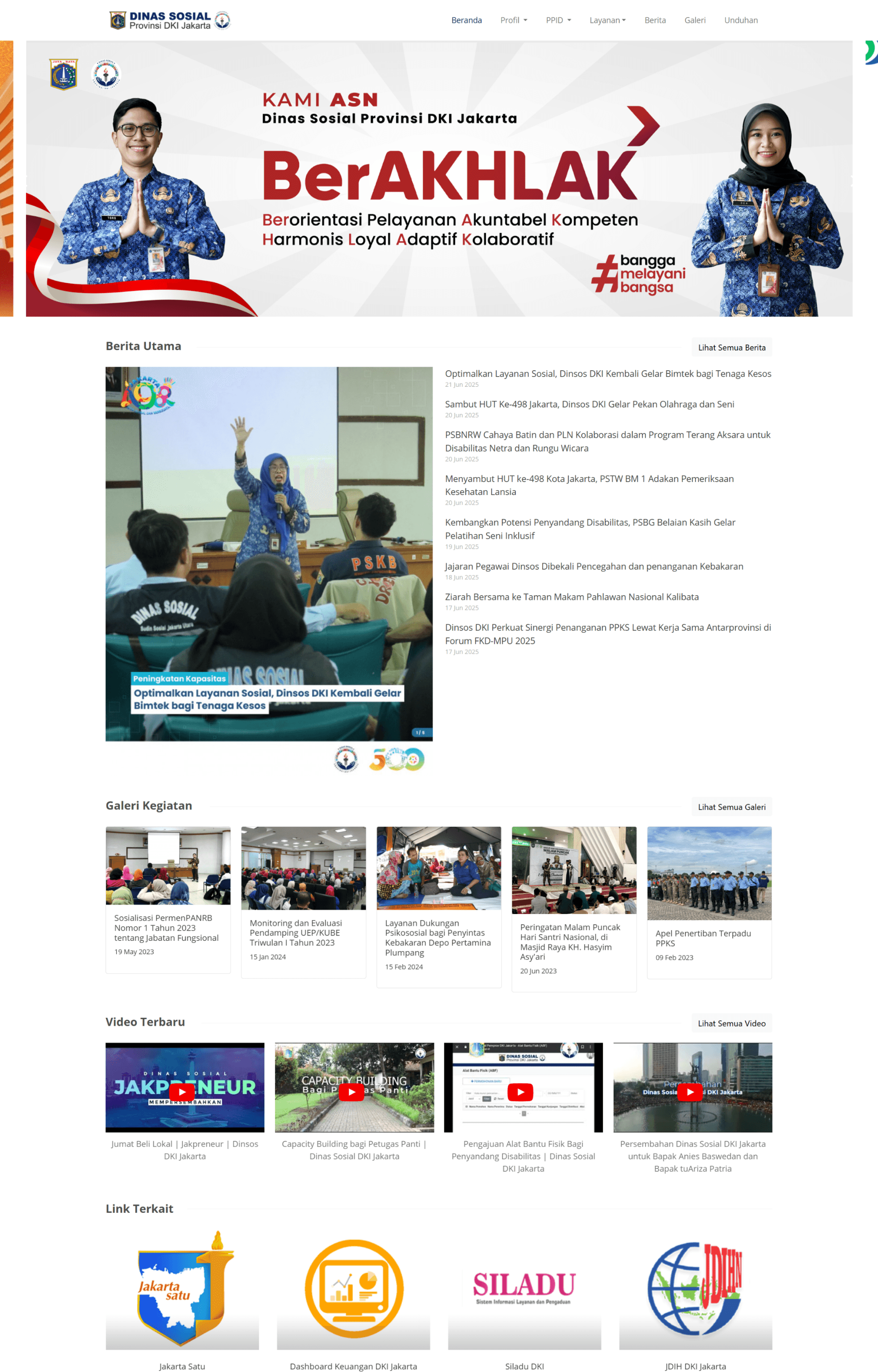
Before Redesign

Before the redesign, the Dinas Sosial DKI Jakarta website had an unresponsive layout, unclear content structure, and outdated visual design. Users struggled to find key services such as social assistance or program information due to a complex and unintuitive navigation system. The mobile experience was especially poor, making it difficult for elderly users or those with limited digital skills to access essential content.
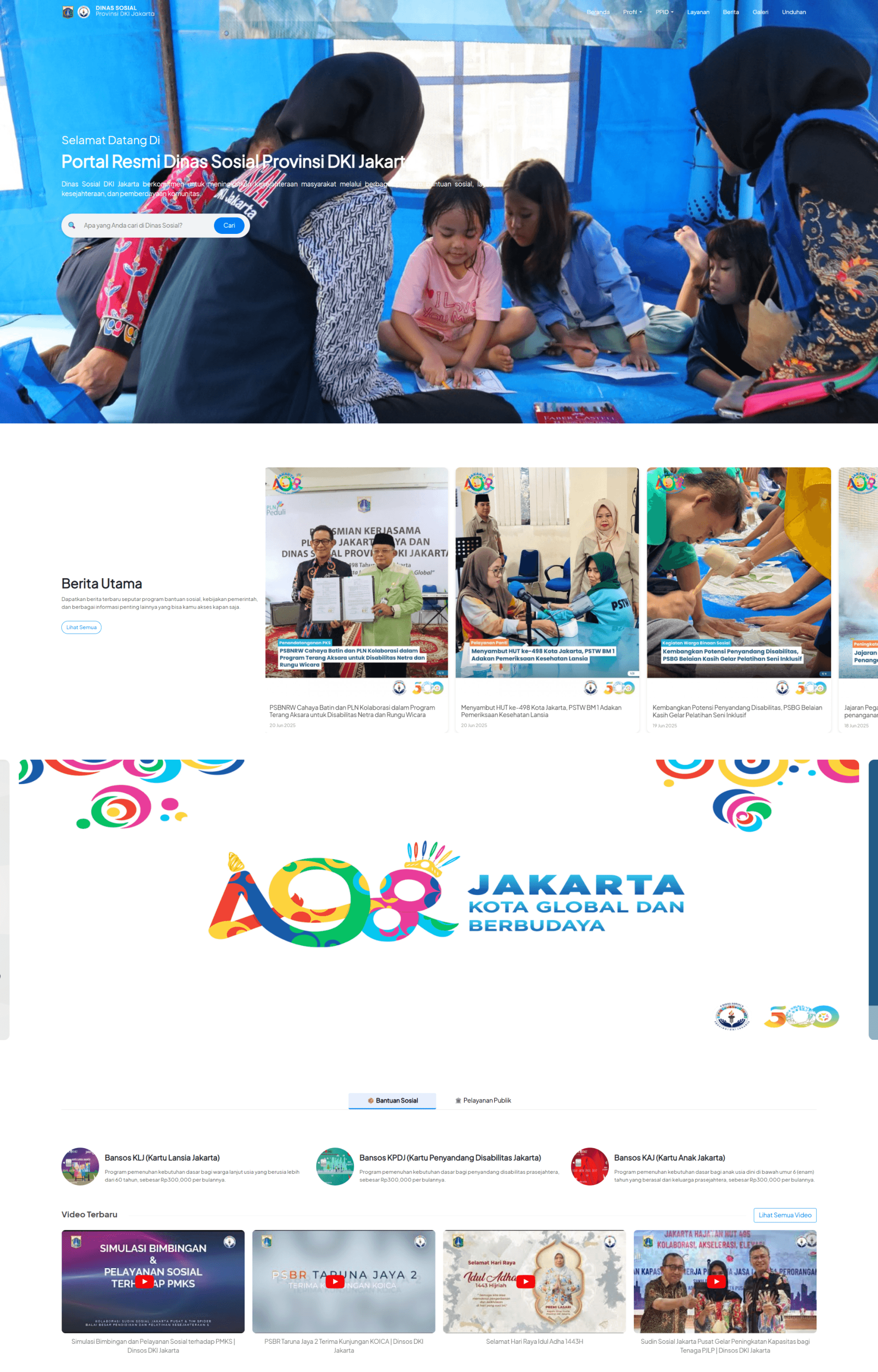
After Redesign

After the redesign, the website now features a clean, modern, and user-friendly interface. Navigation was simplified, the content hierarchy was reorganized based on user needs, and the visual identity was refreshed to reflect the professionalism of a government institution. The site is fully responsive, providing a consistent experience across both desktop and mobile devices. As a result, users can now access information faster and more comfortably, with improved trust in the digital experience.
06. CLOSING

The Final Call

The Final Call

The Final Call

Impact

This project gave me the opportunity to design a digital product that directly serves the public. It challenged me to prioritize usability, clarity, and accessibility at every step of the process. By working on a real world government website, I developed a deeper understanding of how to simplify complex information structures and turn them into intuitive, user-friendly interfaces. It also strengthened my ability to design for a diverse audience, especially for people with limited digital literacy or elderly users who rely on clarity and simplicity. The outcome not only improved the user experience for citizens but also elevated the credibility of the institution through a more trustworthy and professional online presence.

Strengthened my ability to design complex dashboards with multiple components while maintaining clarity. Gained hands-on experience in creating user-friendly task management interfaces based on real user flows. Improved my skills in organizing data visually using layout, color, and typography to enhance usability. Helped me better understand the importance of role-based information visibility in collaborative environments.

Strengthened my ability to design complex dashboards with multiple components while maintaining clarity. Gained hands-on experience in creating user-friendly task management interfaces based on real user flows. Improved my skills in organizing data visually using layout, color, and typography to enhance usability. Helped me better understand the importance of role-based information visibility in collaborative environments.

Lesson Learned

Designing for a government institution taught me that functionality and accessibility should never be compromised for aesthetics. I learned that clear information hierarchy and straightforward navigation are essential to ensure users can find what they need without confusion. Collaborating with public sector stakeholders also improved my communication and decision-making skills, especially when aligning design solutions with organizational goals. One key takeaway was the importance of building scalable design components that can grow with the site while maintaining consistency. Ultimately, this project reminded me that good design is about making people's lives easier especially in essential public services.

Designing for productivity tools requires more than just clean visuals functionality and user context are everything. Paying attention to small details like icon placement, spacing, and label clarity can significantly improve user interaction.

Iterating and testing different layout styles (like list vs. Kanban) helped me understand what works better for different user needs. I realized how critical it is to keep interfaces scalable for future updates without overwhelming the user.

Designing for productivity tools requires more than just clean visuals functionality and user context are everything. Paying attention to small details like icon placement, spacing, and label clarity can significantly improve user interaction.

Iterating and testing different layout styles (like list vs. Kanban) helped me understand what works better for different user needs. I realized how critical it is to keep interfaces scalable for future updates without overwhelming the user.

2025 All rights reserved

Create a free website with Framer, the website builder loved by startups, designers and agencies.